Home|Blog|How Artists Use Colour Theory to Create Emotion in Paintings
How Artists Use Colour Theory to Create Emotion in Paintings
Posted by: Rupashree Ravi
Colour is a potent tool in the artist's arsenal, with the remarkable ability to elicit emotions, establish mood, and communicate messages without the need for words. Artists, from the vibrant palettes of Vincent van Gogh's masterpieces to the subtle, muted tones in Vermeer's works, have long recognised the profound impact of colour on their art.
Colour theory encompasses both the science and art of effectively utilising colour in design and visual arts. It offers a structured framework for comprehending how colours interact, their relationships, and the emotional responses they can provoke.
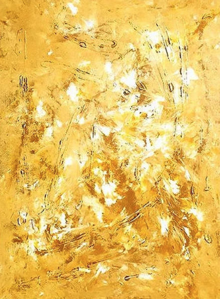
The skillful blending and strategic use of primary, secondary, and tertiary colours serve to convey emotions and meaning in paintings. For example, red is often linked to passion, love, and anger due to its capacity to evoke powerful emotions, while blue is harnessed to symbolise peace and stability, and it can also depict feelings of sadness or isolation. Inside the Sunflower by Monica Garcia Ricardo
Yellow exudes feelings of happiness, positivity, joy, and optimism, whereas a combination of colours, such as purple, is employed as a regal hue symbolizing luxury, mystery, and creativity.
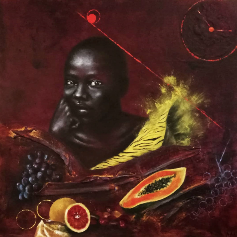
Artists meticulously choose colours to match the mood they aim to express. They blend these colours to achieve harmony or contrast, applying the principles of colour theory to captivate the viewer's emotions and perceptions. Time Doesn’t Wait by Almudena Angoso
The influence of colour in art is unquestionable. Grasping the emotional resonance of colour serves as a key to unlocking the intricacies and depth of art, enabling us to connect with the artist's intentions. In doing so, we embark on a journey to explore the intricate tapestry of human emotions and experiences that art beautifully encapsulates.